1. PB News
2. PB Updates
3. PB Mag
4. PBgram
5. PB Chat
6. Team PB
7. PBS
8. PB Factor
9. PB 6thform
10. PB extra
Friday 30 September 2016
Identifying key coventions of a front cover
The front covers on magazines are used to draw the audience in and give them a brief insight to what will be in the magazine. There are key things that will be on the front cover which will do this.
One convention is the main image. Every magazine front cover has one, it usually is of the person/people that the magazine is featuring in that issue. For example, Drake being on the cover of Vibe magazine. This is one of the first things the audience will spot and will straight away catch their attention if they like who is on the front cover. This is also a reason why magazines tend to like using well established people on their front covers as it will entice a wider audience.
Another key convention is the masthead. This it the brand of the magazine for example, NME or Billboard. The masthead is usually found at the top of the front cover. It will incorporate fonts, colours or shadows etc. in order to make it stand out so that people can spot what brand magazine it is easily.
A headline is another convention which is found on front covers. It is the main article in the magazine and due to this, it tends to be the biggest or second biggest font on the front cover other than the masthead. It being the biggest article on the cover will mean that it is the first article which will be caught by the audiences attention. The headline typically goes along with the main image. For example, if Justin Bieber was the main image, then the headline would relate to him. The headline is also often found in front of the person on the main image; typically on the body, never the face.
Another key convention is a pug. This is the shape on the cover which has a bit of text inside. The shape is used to make it stand out on the page from the rest of the text and the main image. Not all magazines have this however, it is a great way to catch the audiences attention as the shape makes it pop out on the cover and therefore is hard to miss.
A banner is another convention often seen on a front cover. This is the rectangle at the bottom of the cover with typically around 3 pieces of text in. The text in the banner is used to show the type of stuff the magazine contains. For example, it could say inside the banner 'interviews, quizzes and much more' etc. The fill of the banner is usually a colour which stand out compared to the other colours on the magazine cover.
Another key convention is the house style. This is sort of like the theme of the magazine. It makes the brand of the magazine recognisable to the audience as there will be things which are styled the same or in a similar way in each issue. For example, the font of the headline and cover lines might be the same or similar in every issue. Another example is the magazine might use the same range of colours in their issues etc.
Cover lines are another convention. This is text which often goes around the people on the main image. There will usually be around 2 to 5 of them on a cover. They tell the audience what articles are in the issue. The articles chosen to be on the cover will be the ones which will most entice the audience to read/buy the magazine. Furthermore, these will be the more important articles in the magazine.
Thursday 29 September 2016

Tuesday 27 September 2016

Monday 26 September 2016


Sunday 25 September 2016

Thursday 22 September 2016
Target audience for a school magazine
The target audience that would read a school magazine are:
- students (aged 11-18 years old) that are within the catchment/go to the school
- parents of the students
- teachers who work there (25 years old+)
- the council of the area
Examples of content in school magazines
In school magazines you typically find content like:
- important dates to remember
- contacts section
- information and achievements of extra-ciriculam activities like football etc.
- new teachers/if a teacher is leaving
- puzzles
- upcoming events
- school awards
- reminders about school
Monday 19 September 2016
Masthead research and analysis

This is the masthead for NME magazine, which covers all of the latest music mainly covers pop, RnB and some bands etc. so this magazine aims to a wide audience as it covers a lot of the popular music that is out. It uses a sans-serif font as it is a more modern, simple and bold font. It uses a drop shadow effect which gives the masthead a 3D effect and in result makes it more eye catching. Another aspect of the masthead that noticed was it is all in uppercase letters, this is probably because as the name is only three letters the producers would want to make it pop as much as they can in order for it to stand out from everything else on the front cover. The colours the masthead incorporates is a red uniform fill, a white stroke and a black stroke around the white stroke. This makes the masthead pop because all three colours are contrasting which makes it stand out.
This is the masthead for Rolling Stone magazine, which is aimed towards younger readers like teenagers/young adults, its content focuses on popular music and big music artist like for example, Rihanna and Ed Sheeran etc . It uses a serif font as has brackets, hooks and feet. By using a serif font it could suggest that the magazine is a more popular and upper class music magazine compared to others, as the serif is a more upper class, formal and conservative font. It also is written in lower case letters other than the 'R' and 'S' in the name. The masthead also uses a drop shadow which makes it look 3D and stand out on the front cover. Another aspect of the masthead was they choice of colours it uses. The three colours used in the masthead are red, white and black which are all colours that contrast with each other. It has a red uniform fill, a white stroke and a black stroke after the white. The colours the masthead uses and they way the colours have been used makes the masthead eye catching.
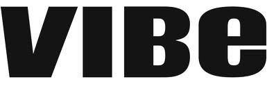
This is the masthead for Vibe magazine, which mainly covers the genre RnB, hip hop, and rappers in general. the magazine's intended audience is meant to be a younger audience like teenagers around the age of 16-18+ years old as the magazine covers a genre that typically people of that age are more interested in compared to a person that is in their 40's. It uses a sans-serif font as it has no brackets, hooks and feet. The use of the sans-serif font makes the masthead look modern and sleek. It also uses a mixture of both upper case and lower letters, for example, the 'B' is upper case but the 'e' is lower case. This gives the magazine a more creative flare than if it was either all written in upper case or lower case. The masthead only incorporates the colour black and therefore gives a simplistic look to the magazine, especially with the use of a sans-serif font.

This is the masthead for Billboard magazine. It uses a sans-serif font which makes it look simple, modern and bold, this can suggest how Billboard is a modern magazine that will keep the audience up to date on all the popular, new and up coming music. Billboard magazine is known for publishing a 'Billboard hot 100' which will keep the audience updated on what music is hot and trending. The target audience varies widely as the magazine doesn't focus on just one particular genre of music and therefore, starts anywhere from around 16+ years old. It also uses all lower case letters other than the 'B' at the start of the name. The masthead keeps it simple by using black for the text however, makes it stand out by giving it a pop of colour in the circles of the letters. The colours it uses are red, yellow, blue and green.
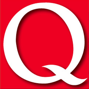
This is the masthead for Q magazine, which is an alternative music magazine, and mainly covers the genres pop and rock with mostly influential artists as their features and some older artists. The magazine's intended audience are adults aged 30-40 years old who are interested in alternative/rock music. It uses an upper case 'Q', this is probably because as the name is only one letter they want to make it big and bold so it pops from the rest of the stuff on the front cover. The masthead uses white and red. These two colours contrast and therefore makes the white text stand out and be more eye catching to the audience than if the two colours complemented each other. Another aspect of the masthead I noticed was it uses a drop shadow. This has been done in order to made the 'Q' look 3D and in result stand out on the front cover.
Subscribe to:
Posts (Atom)