
Monday 12 December 2016
Thursday 8 December 2016

Target audience for my magazine
The target audience for my magazine will be for people in the age range of 16-30. This is because people in this age range will be more likely to enjoy the genre of music my magazine focuses on. For example, someone who is in the older generation such as 50's/60's for instance, they would be more likely to enjoy listening to older music. The audience for my magazine will consist of both males and females. However, there would probably a higher percentage of males who read the magazine but I'm not making my magazine gender specific as anyone can read the magazine regardless of their gender in society. If I was to give a percentage ratio of the likely male/female audience it would probably be 60% males and 40% females. The magazine would not effect who the target audience is in terms of their occupation as the magazine would be cheap enough for the audience to buy regardless of their job.
The people who would read my magazine would be likely to listen to music through devices such as their phone, iPod etc. However, they would also be likely to buy music in the format of vinyl records. Those would would buy the magazine would enjoy listening to music, playing instruments such as the guitar etc. and going to gigs and festivals. The target audience for my magazine would enjoy listening to groups such as Arctic Monkey, 1975, The Last Shadow Puppets, Oasis, Catfish and the Bottlemen etc. In terms of socio-economic group, my target audience can vary as the magazine does not restrict to one group but the most likely socio-economic group my audience would fall into are working class and skilled working class. This is because based on the bands the magazine features, they wear quite normal clothes showing them to be quite humble and not all about having really expensive flashy items. Typically people will try to be like the people they like/look up to. Therefore, the audience of the magazine will follow along with this and be quite normal everyday people who don't feel the need to have expensive, flashy clothing items as both them and the bands in this genre are more about the music.
Monday 5 December 2016

Thursday 1 December 2016

Monday 28 November 2016


Thursday 24 November 2016

Monday 21 November 2016

Ideology and brand identity for my magazine
The ideology for of my magazine primarily values the indie rock music genre and keeps this genre as it's main focus. The main value of (indie rock) music being the main value in my magazine is shown in the name which is 'Sound' as music is the sound the individual listens to. The font of the masthead has these sort of waves in it which I have used to represent a sound wave; to further the idea of 'Sound'. My magazine values new music within this genre and also more established artists who have made a name for themselves in the music industry such as Arctic Monkeys, Oasis and Fallout boy etc. The reason it values both new and old is because the new artists show how the music industry is developing in the genre and introduces the reader to more artists they might enjoy. The more established/older artists show the history of music within the genre and shows who the new artists have been influenced by. It believes that music and live music is important and influential and therefore, is not just something an individual listens to but brings connections and is an important part of life. My magazine does believe that technology can be important in the development of music and can also enable more people to listen to it due to things like Youtube and Soundcloud. However, it believes that it is important to keep more traditional ways of listening to music like records and seeing the artists live.
Thursday 17 November 2016
Plan for music magazine front cover photos
For the main image on the front cover of my magazine I plan to be doing either a medium shot or a medium long shot. This will either be of one or two people, and will be on either a plain white background or a colour background but keeping it fairly simple to keep the focus on the person/people. The person/people will either be gazing into the distance or at the camera whilst keeping a neutral facial expression. For the costume, the person will wear quite casual clothing with colours such as black, white, blues and greens. This is because indie rock artists tend to wear quite a casual look like jeans, a t-shirt or a shirt and a jacket in order to keep the focus more on the music; being quite humble to what they produce as they care more about the music than the image.
Monday 14 November 2016
Masthead review from target audience
Brand identity and ideology of Q magazine

Q magazine presets an ideology that values more well established artists that have been around for awhile and are more recent as the magazine itself is almost like the connoisseur of music. The magazine focuses it's content on indie and rock bands and artist who have contributed to the music industry, and some well-known pop and rap music. Q magazine believes that the music industry is important part of life; valuing the history of music and how it has progressed over the generations by featuring very well-known, established artists such as Oasis, Michael Jackson, The Killers, and Adele. The magazine's target audience is aged 16-30 years old but is aimed more towards older people as they will know more of the older artists who feature in the magazine. It mostly targets males because of the content and style that the magazine produces. Majority of the readers will have an interest in indie and rock music. Q magazine values the history music has and shows this throughout with the artist the magazine puts on the front covers, also how the magazine doesn't particularly experiment with vibrant colours. However, the masthead is typically the brightest colour on the page drawing the audiences attention to the brand name showing how the magazine is proud to be who they are and what hey produce in their magazine. Within the magazine it is filled with lots of interviews, events, news and updates to keep the reader interested and kept up-to-date with the what's happening in the music industry. The layout and composition of the magazine is typically uses a monochrome and grey scale theme (other than the main image) with a pop of colour (usually red) in the masthead and parts of the cover lines/head lines on the cover. This is to keep their conservative look.
Tuesday 8 November 2016

Monday 7 November 2016

Wednesday 2 November 2016
Tuesday 25 October 2016
Rule of thirds explained
 The rule of thirds is when photos are split up into thirds with two imaginary lines vertically and two imaginary lines horizontally. This creates three rows and three columns which splits the image up into nine sections. The rule of thirds is a photographic composition. It origins from the theory that an audience is drawn to the intersection points when photos are split into thirds.
This is an example of what the imaginary lines would look like. The rule of thirds is used in a variety of different photo compositions such as portrait images and landscape images.
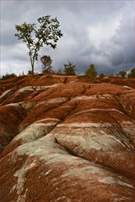 When using this rule in a landscape composition the horizon line should either be positioned near the upper horizontal line or the lower horizontal line. Where the horizon is positioned in terms of which horizontal line; will depend on what the photographer wants the focus of the photo to be. For example if the photographer wanted the focus to be the sky, the horizon will be positioned on the lower horizontal line. If the focus was going to be on the land rather than the sky, the horizon would be positioned on the upper horizontal line. This is an example of the rule of thirds being used in a landscape image, the main focus of the photo is the land as the horizon has been positioned near the upper horizontal line resulting in majority of the image being the land and drawing the attention of the audience towards the land.
 When using the rule of thirds in portraits if the person is looking straight on at the camera like in the example, the eyes often tend be positioned so that each eye is on the (upper) intersections where the two vertical lines meet the horizontal line. In result of having the eyes positioned on these intersections it will mean that the other key facial features like the nose and mouth will be in the centre of the photo on the middle square section, like in the example.
The sources I have referred to throughout this blogpost and have used images from are:
http://learnprophotography.com/rule-of-thirds
http://www.ultimate-photo-tips.com/photography-rule-of-thirds.html
Thursday 20 October 2016

Monday 17 October 2016
Identifying key conventions in contents pages
In magazines the contents page is used as almost like a map of the magazine. It gives a further insight to what articles and features are in the magazine than the front cover does, and it tells the reader what page to find each article on. It also can give a brief overview of what is in each article and feature in order for the reader to gather an understanding of what sort of content they will be reading. Some features shown on the contents page may also be a regular addition for each issue that is produced. For example, a monthly quiz or a particular person's column that they always write.
When creating the contents page there is guidelines that must be followed to keep the contents page layout and design looking professional and not messy. In order to achieve this rulers and grid lines must be used to construct the design layout that is desired. An example of how the rulers and gridlines work is, when creating the contents page the rulers will tell you the measurements of how big an image or column is etc. and how far away everything is from each other. The grid lines help you see where the centre of the page is and can make a perimeter within the page of where all the features can go, for example keeps everything a specific distance away from the edge of the page.
Typically, on a contents page there will be the title (usually saying 'contents') at the top on the page. this is sometimes accompanied by the magazines masthead and other features like the issue date, and other ways to access the brand like their web address and their social media usernames if they have any form of social media. For example, if the magazine brand can be found on Twitter then they will have it on the contents page.
Generally on a contents page there will be either 1 or 2 columns which contain the information of where the different sub-headings (each article and feature) is in the magazine and a bit about each one; this is the blurb for each article. With each of these sub-headings there are numbers that go with it to direct people to the page that they can find the article on. Every contents page will have this. Sub-headings (each article and feature) will be written in a bigger font size that the blurb underneath the headings. This is done to put more emphasis on the headings as it is the key part the audience would be looking for and is the purpose of the contents page overall; that the audience can find which page each article/feature is on. A typical guideline to follow when deciding a font side is no bigger than 24pt and no smaller than 10pt.
Another convention that is used in a contents page is photos that relate to an article. the images will have a written caption and number with it (the number is the page number that the article is on), this is to give anchorage. The way that importance of articles is shown through the images is that the larger the image the more important the article it relates to is.
 Finally, on a contents page there is also usually an editors letter which can be a message to the audience reading the magazine. Sometimes there is also a callout box, this is where the magazine subscription information usually would be found.
Here is an example of a contents page.
When creating the contents page there is guidelines that must be followed to keep the contents page layout and design looking professional and not messy. In order to achieve this rulers and grid lines must be used to construct the design layout that is desired. An example of how the rulers and gridlines work is, when creating the contents page the rulers will tell you the measurements of how big an image or column is etc. and how far away everything is from each other. The grid lines help you see where the centre of the page is and can make a perimeter within the page of where all the features can go, for example keeps everything a specific distance away from the edge of the page.
Typically, on a contents page there will be the title (usually saying 'contents') at the top on the page. this is sometimes accompanied by the magazines masthead and other features like the issue date, and other ways to access the brand like their web address and their social media usernames if they have any form of social media. For example, if the magazine brand can be found on Twitter then they will have it on the contents page.
Generally on a contents page there will be either 1 or 2 columns which contain the information of where the different sub-headings (each article and feature) is in the magazine and a bit about each one; this is the blurb for each article. With each of these sub-headings there are numbers that go with it to direct people to the page that they can find the article on. Every contents page will have this. Sub-headings (each article and feature) will be written in a bigger font size that the blurb underneath the headings. This is done to put more emphasis on the headings as it is the key part the audience would be looking for and is the purpose of the contents page overall; that the audience can find which page each article/feature is on. A typical guideline to follow when deciding a font side is no bigger than 24pt and no smaller than 10pt.
Another convention that is used in a contents page is photos that relate to an article. the images will have a written caption and number with it (the number is the page number that the article is on), this is to give anchorage. The way that importance of articles is shown through the images is that the larger the image the more important the article it relates to is.
Finally, on a contents page there is also usually an editors letter which can be a message to the audience reading the magazine. Sometimes there is also a callout box, this is where the magazine subscription information usually would be found.Here is an example of a contents page.
Saturday 15 October 2016

Thursday 13 October 2016


Thursday 6 October 2016

Wednesday 5 October 2016
Monday 3 October 2016
Plan for photos
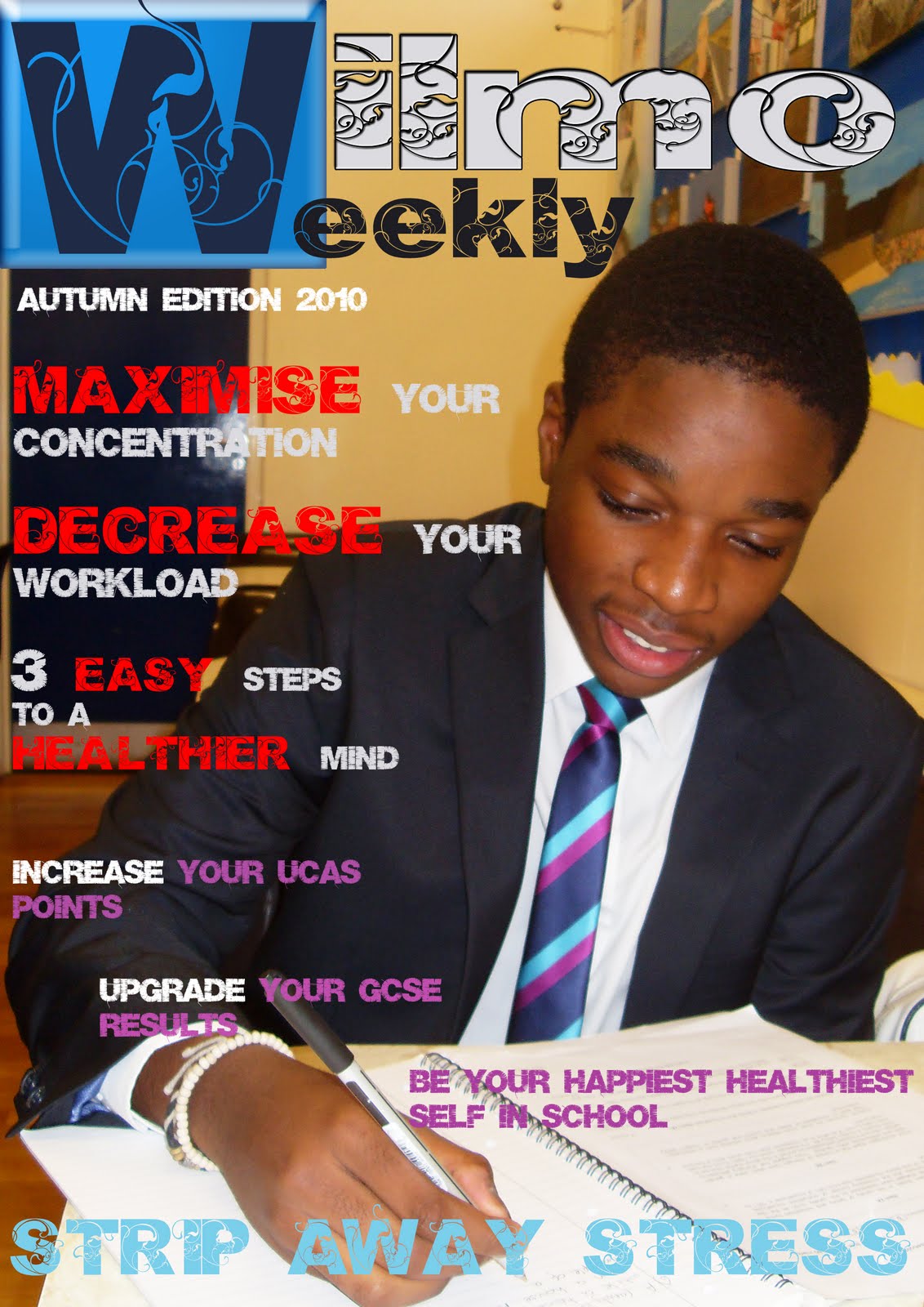
The photos I want to take for my school magazine is a photo of a Jai who is a current sixth former at the school because i think it will be good to have a current student to represent the school on the front cover. I would like to take the photo somewhere in the school because I feel that if it is a school magazine then the pictures for the magazine should also be taken in school. For example, the photos could be taken in the library at one of the computers or at a desk or just in the hallway by some of the other students work that is on the wall etc. In the photos I want Jai to be either in her school uniform or in some nice presentable clothes in order to represent the school. In the photos i would like Jai to either be looking like she is doing some work on a computer or at a table or to at least be standing by some work on the walls that other students have done. This is to show that the students at Plantsbrook school are hard working individuals. I would also like Jai to be looking at the camera smiling, in order to represent the school in a positive way, showing that it is a happy school that students are happy to go to. the camera shot I would be doing is either a medium close up (MCU) or a medium shot because I feel that those 2 camera shots are the most suitable for my magazine. These are two example of a medium close up shot and a regular medium shot, that I would be using in my photos.


Friday 30 September 2016
School magazine masthead ideas
1. PB News
2. PB Updates
3. PB Mag
4. PBgram
5. PB Chat
6. Team PB
7. PBS
8. PB Factor
9. PB 6thform
10. PB extra
2. PB Updates
3. PB Mag
4. PBgram
5. PB Chat
6. Team PB
7. PBS
8. PB Factor
9. PB 6thform
10. PB extra
Identifying key coventions of a front cover
The front covers on magazines are used to draw the audience in and give them a brief insight to what will be in the magazine. There are key things that will be on the front cover which will do this.
One convention is the main image. Every magazine front cover has one, it usually is of the person/people that the magazine is featuring in that issue. For example, Drake being on the cover of Vibe magazine. This is one of the first things the audience will spot and will straight away catch their attention if they like who is on the front cover. This is also a reason why magazines tend to like using well established people on their front covers as it will entice a wider audience.
Another key convention is the masthead. This it the brand of the magazine for example, NME or Billboard. The masthead is usually found at the top of the front cover. It will incorporate fonts, colours or shadows etc. in order to make it stand out so that people can spot what brand magazine it is easily.
A headline is another convention which is found on front covers. It is the main article in the magazine and due to this, it tends to be the biggest or second biggest font on the front cover other than the masthead. It being the biggest article on the cover will mean that it is the first article which will be caught by the audiences attention. The headline typically goes along with the main image. For example, if Justin Bieber was the main image, then the headline would relate to him. The headline is also often found in front of the person on the main image; typically on the body, never the face.
Another key convention is a pug. This is the shape on the cover which has a bit of text inside. The shape is used to make it stand out on the page from the rest of the text and the main image. Not all magazines have this however, it is a great way to catch the audiences attention as the shape makes it pop out on the cover and therefore is hard to miss.
A banner is another convention often seen on a front cover. This is the rectangle at the bottom of the cover with typically around 3 pieces of text in. The text in the banner is used to show the type of stuff the magazine contains. For example, it could say inside the banner 'interviews, quizzes and much more' etc. The fill of the banner is usually a colour which stand out compared to the other colours on the magazine cover.
Another key convention is the house style. This is sort of like the theme of the magazine. It makes the brand of the magazine recognisable to the audience as there will be things which are styled the same or in a similar way in each issue. For example, the font of the headline and cover lines might be the same or similar in every issue. Another example is the magazine might use the same range of colours in their issues etc.
Cover lines are another convention. This is text which often goes around the people on the main image. There will usually be around 2 to 5 of them on a cover. They tell the audience what articles are in the issue. The articles chosen to be on the cover will be the ones which will most entice the audience to read/buy the magazine. Furthermore, these will be the more important articles in the magazine.
Thursday 29 September 2016

Tuesday 27 September 2016

Monday 26 September 2016


Sunday 25 September 2016

Thursday 22 September 2016
Target audience for a school magazine
The target audience that would read a school magazine are:
- students (aged 11-18 years old) that are within the catchment/go to the school
- parents of the students
- teachers who work there (25 years old+)
- the council of the area
Examples of content in school magazines
In school magazines you typically find content like:
- important dates to remember
- contacts section
- information and achievements of extra-ciriculam activities like football etc.
- new teachers/if a teacher is leaving
- puzzles
- upcoming events
- school awards
- reminders about school
Monday 19 September 2016
Masthead research and analysis

This is the masthead for NME magazine, which covers all of the latest music mainly covers pop, RnB and some bands etc. so this magazine aims to a wide audience as it covers a lot of the popular music that is out. It uses a sans-serif font as it is a more modern, simple and bold font. It uses a drop shadow effect which gives the masthead a 3D effect and in result makes it more eye catching. Another aspect of the masthead that noticed was it is all in uppercase letters, this is probably because as the name is only three letters the producers would want to make it pop as much as they can in order for it to stand out from everything else on the front cover. The colours the masthead incorporates is a red uniform fill, a white stroke and a black stroke around the white stroke. This makes the masthead pop because all three colours are contrasting which makes it stand out.
This is the masthead for Rolling Stone magazine, which is aimed towards younger readers like teenagers/young adults, its content focuses on popular music and big music artist like for example, Rihanna and Ed Sheeran etc . It uses a serif font as has brackets, hooks and feet. By using a serif font it could suggest that the magazine is a more popular and upper class music magazine compared to others, as the serif is a more upper class, formal and conservative font. It also is written in lower case letters other than the 'R' and 'S' in the name. The masthead also uses a drop shadow which makes it look 3D and stand out on the front cover. Another aspect of the masthead was they choice of colours it uses. The three colours used in the masthead are red, white and black which are all colours that contrast with each other. It has a red uniform fill, a white stroke and a black stroke after the white. The colours the masthead uses and they way the colours have been used makes the masthead eye catching.
This is the masthead for Vibe magazine, which mainly covers the genre RnB, hip hop, and rappers in general. the magazine's intended audience is meant to be a younger audience like teenagers around the age of 16-18+ years old as the magazine covers a genre that typically people of that age are more interested in compared to a person that is in their 40's. It uses a sans-serif font as it has no brackets, hooks and feet. The use of the sans-serif font makes the masthead look modern and sleek. It also uses a mixture of both upper case and lower letters, for example, the 'B' is upper case but the 'e' is lower case. This gives the magazine a more creative flare than if it was either all written in upper case or lower case. The masthead only incorporates the colour black and therefore gives a simplistic look to the magazine, especially with the use of a sans-serif font.

This is the masthead for Billboard magazine. It uses a sans-serif font which makes it look simple, modern and bold, this can suggest how Billboard is a modern magazine that will keep the audience up to date on all the popular, new and up coming music. Billboard magazine is known for publishing a 'Billboard hot 100' which will keep the audience updated on what music is hot and trending. The target audience varies widely as the magazine doesn't focus on just one particular genre of music and therefore, starts anywhere from around 16+ years old. It also uses all lower case letters other than the 'B' at the start of the name. The masthead keeps it simple by using black for the text however, makes it stand out by giving it a pop of colour in the circles of the letters. The colours it uses are red, yellow, blue and green.
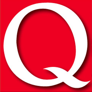
This is the masthead for Q magazine, which is an alternative music magazine, and mainly covers the genres pop and rock with mostly influential artists as their features and some older artists. The magazine's intended audience are adults aged 30-40 years old who are interested in alternative/rock music. It uses an upper case 'Q', this is probably because as the name is only one letter they want to make it big and bold so it pops from the rest of the stuff on the front cover. The masthead uses white and red. These two colours contrast and therefore makes the white text stand out and be more eye catching to the audience than if the two colours complemented each other. Another aspect of the masthead I noticed was it uses a drop shadow. This has been done in order to made the 'Q' look 3D and in result stand out on the front cover.
Subscribe to:
Posts (Atom)